In the world of digital marketing, there’s a silent language that shapes how users perceive your website even before they read a single word — color. While SEO is often discussed in terms of keywords, backlinks, and site speed, the visual elements of your site, particularly your headers (H1s, H2s), play a crucial role in how users interpret your content and brand identity. This is where color psychology becomes more than just design — it becomes a strategic SEO tool.
Today, more businesses are realizing that branding and SEO are not separate silos. The tone of your headers, the hierarchy of your content, and the colors you use — especially in H1s — contribute to user experience, engagement, and even dwell time. These are all signals that can affect your SEO rankings.
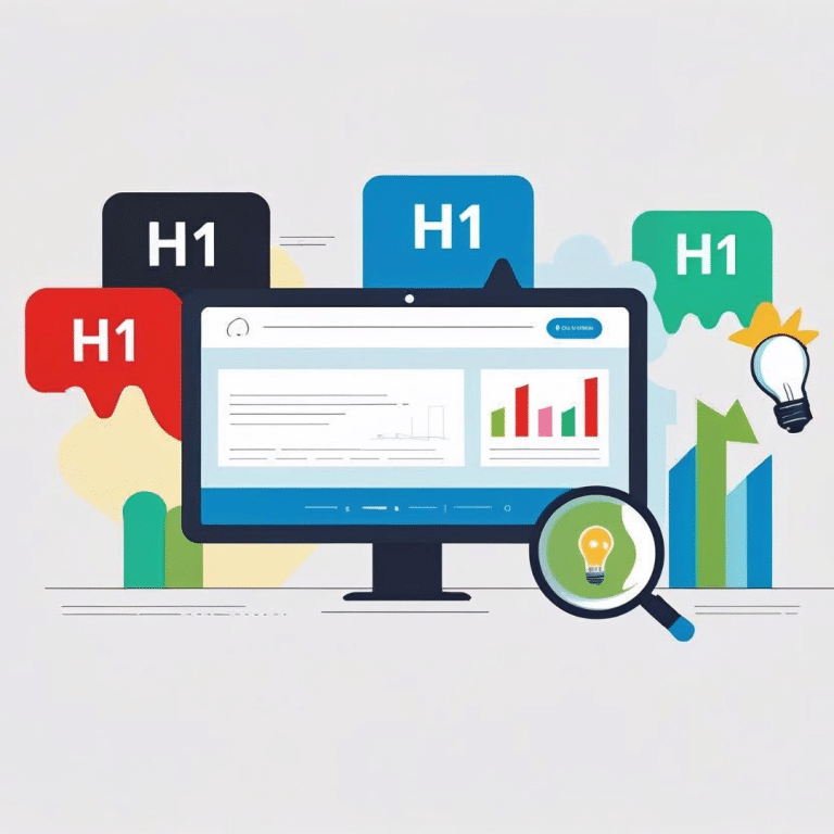
For brands looking to make an impact, working with the Best digital marketing company of Delhi can help align visual identity with search engine performance. But before you outsource, let’s understand how color psychology in headers could be influencing your SEO.
What Is Color Psychology in Digital Marketing?
Color psychology is the study of how colors affect human emotions, behavior, and decisions. In marketing, this means using colors intentionally to:
- Shape brand perception
- Influence buying behavior
- Guide user attention
- Evoke emotional responses
For example:
- Red evokes urgency, excitement, and passion (think Coca-Cola or Netflix).
- Blue signals trust and professionalism (common in banking and tech).
- Green is associated with growth, health, and calmness (popular among wellness and eco brands).
- Black represents luxury, exclusivity, and elegance.
While most people think of color psychology in terms of logos or call-to-action buttons, it also applies to typographic elements — particularly headers, which are the first textual elements users notice on a web page.
Why Headers Matter in SEO
1. H1 Tags Are Your Page’s First Impression
Your H1 is the digital equivalent of a newspaper headline. It signals to both users and search engines what your page is about.
From an SEO standpoint:
H1s help Google understand your content hierarchy.
They guide users in deciding whether to stay or bounce.
They contribute to keyword relevance and click depth.
But the color of your H1 can either reinforce your brand’s message or create confusion.
2. Visual Hierarchy Improves Readability and Engagement
A well-designed page uses headers of varying sizes and contrasting colors to guide the reader naturally. If your H1 blends in with the body text or uses a jarring color, it disrupts the user experience — leading to higher bounce rates and shorter dwell time, both negative for SEO.
3. User Experience Is a Ranking Factor
Google’s algorithm prioritizes content that’s useful and engaging. Color decisions in H1s affect:
- First-glance readability
- Emotional resonance
Perceived value of the content
How Color Influences Brand Perception Through H1s
Imagine a user lands on your site. Your H1 is the largest, most visible element, typically above the fold. If it’s colored in a way that clashes with your brand palette or feels too aggressive or dull, the user’s emotional response may cause them to disengage — even if your content is great.
Here are some examples of how colors in H1s affect perception:
Blue H1s – Professional and Safe
Used widely in corporate and tech sites. Suggests competence, trust, and calmness. Great for industries like finance, IT, and healthcare.
Red H1s – Urgent and Bold
Creates a sense of energy and urgency. Works well for limited-time offers or brands that thrive on intensity — but can feel aggressive if overused.
Green H1s – Calm and Natural
Popular for eco-friendly, wellness, or food brands. Suggests growth, balance, and freshness.
Black H1s – Luxury and Power
Minimalist and bold. Works for fashion, luxury brands, or editorial content, but may feel intimidating if not paired with open whitespace.
Purple or Pink H1s – Creative and Feminine
Common in beauty and lifestyle industries. These evoke emotional and aesthetic appeal.
Read more about Keyword Research in SEO
Best Practices for Using Color in H1s
Stick to Your Brand Palette
Your headers should reflect your brand’s identity. If your brand is built on trust and professionalism, a neon green H1 might feel off-brand. Stay within your brand color palette, ideally choosing 1–2 primary text colors that align with your messaging.
Ensure High Contrast for Readability
A light blue H1 on a white background? That’s a readability nightmare. Use colors that provide sufficient contrast against the background to improve visibility and accessibility. Use WCAG (Web Content Accessibility Guidelines) to ensure your color combinations meet standards.
Limit the Use of Colors in Headers
Too many colors can be distracting. Instead, use one main color for your H1s and reserve accent colors for CTAs or subheadings. This creates visual consistency and a smoother reading experience.
A/B Test Header Colors
Tools like Google Optimize or Hotjar allow you to A/B test header colors. You can measure:
- Bounce rate
- Time on page
- Click-through rate (if the header includes a CTA)
Data will help you decide which colors actually drive better SEO and UX outcomes.
Color Psychology in Action: A Scenario
Let’s say you run a digital magazine on financial wellness. You choose a deep navy blue for your H1s. This aligns with your brand’s promise of security, trust, and clarity. Users scanning the page instantly feel reassured, leading to longer time on site, higher engagement, and more trust in your content — all positive signals for Google.
Now imagine if you had used hot pink H1s instead. Even if the content is excellent, users might not take the page seriously, impacting perception and SEO indirectly.
The Overlooked SEO Advantage
Most SEO guides focus on content quality, backlinks, and schema — but they ignore the emotional cues that colors deliver, especially in headers. When H1s are thoughtfully designed, using color psychology as a guide, they can:
- Build trust and brand recall
- Improve content hierarchy and readability
- Reduce bounce rate and improve dwell time
- Complement keyword optimization efforts
It’s a visual SEO win that amplifies all your other strategies.
Conclusion: Color Isn’t Just Design — It’s SEO Strategy
In the race to the top of search results, every element on your website counts — even the color of your headers. While keywords and backlinks are critical, user engagement is the ultimate SEO goal, and color directly impacts how users interact with your content.
By using color psychology in your H1s, you can improve not just aesthetics, but also how users feel, read, and respond — which ultimately influences how Google ranks your content.
If you want to build a brand that looks great, ranks well, and feels trustworthy to your audience, collaborating with the Best digital marketing company of Delhi can help you integrate design and SEO seamlessly.
Because in 2025, the smartest brands know: Design is not separate from SEO — it is SEO.